Old School Lessons of the Pepsi Generation
I am helping my husband plan his family reunion. We have immersed ourselves in nostalgia, going through old photo albums, connecting with Aunt Hazel’s kids on Facebook, and remembering the unique family history that only members in that exclusive club can appreciate.
As part of the fun, we are trying to create a feeling of yesteryear at the reunion. We have tracked down candy on the internet from the 1960s–Mallow Cup anyone? In addition to the candy, it has been remarkably easy to find the stuff of yesterday today. Tough economic times seem to have people yearning for and snacking on the comforting things from the past. The thing I cling to the most is my beloved Diet Pepsi. I think by now many people are use to seeing me clutch a 24-ounce bottle of my beverage of choice in meetings and across campus. It is something that has been part of me for decades now, and it never fails to bring comfort. Yeah, I know…it’s almost like I never got over my baby bottle.
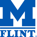
There is something about seeing the iconic images of the familiar that brings a combination of stability and hope. The best iconic advertising images are ones that stay rooted and true to what they represent. I put the University of Michigan-Flint logo in that category. UM-Flint gets a lot of mileage out of its logo. The recognizable block M with the word “Flint” has existed for over a quarter of a century.
In Logo-land, that’s some serious brand equity that has been built up over time. The logo has survived and thrived the journey.
Sadly, some people believe that logo redesigns can be a “magic bullet” solution to problems of popularity and profitability. One example of a logo redesign that has been almost universally criticized is the redesign of the Pepsi logo.
In this article by Fast Company Magazine which includes a really embarrassing pitch by the ad agency responsible for the redesigned logo, you can see how a multi-million dollar company was easily persuaded by a marketing group that a logo redesign was key to their brand success.
What followed that redesign was a continued slump in sales.
As someone who came of age during the Pepsi Generation, took the Pepsi Challenge, and has been a Pepsi drinker most of my adult life, the logo is not why I drink Pepsi. I like how it tastes. I can’t drink the logo. They could have added a hyena wearing a leisure suit to the logo and I would still drink it. Coke can change their logo all they want, and it’s still not going to be my preferred beverage.
Over the years, I have been asked to change the UM-Flint logo.
Early in my career in UM-Flint, I had my own Pepsi redesign moment. I allowed an advertising agency to “refresh” (Agency-speak for “fix something that isn’t broken”) the logo, using a weird Helvetica variant on the word “Flint.” That lasted less than a year. It is always something that I look back on with great regret. At least I didn’t let them do a complete redesign which is what they really wanted. Their complaint was that the logo was “outdated,” and “clunky.”
Whatever.
The UM-Flint logo is a graphic representation of everyone’s personal experience at this university. A brand experience is much more about a student being inspired by a faculty member than it is about the font of the logo. However, the logo really comes to life when it is seen by people as standing for something meaningful and important. That can only be done through action, or “academics in action” as we like to say in University Relations. When an image is instantly recognizable to your target audience, that is a major achievement.
Granted, not all of our target audiences are familiar with our university. But, our logo contains within it one of the most powerful images in all of higher education: the Block M. Our logo manages to combine the tradition of an excellent education combined with our roots in the Flint community. This single image communicates to people who don’t know us well that we are the University of Michigan.
Time has strengthened the courage of my convictions. I am proud of our UM-Flint logo. I want to find and thank the people who designed and approved that logo. To those who want to see a changed logo, it won’t happen as long as I am the guardian of it. I have an abiding respect and admiration for the icon that has come to mean so much to so many.
One last word on the UM-Flint logo: Long before I came to work here in 2001, I use to commute from my old job and I would drive past the central plant, and the huge yellow UM-Flint logo. I remember so well the feeling I would have as I drove home (probably guzzling a Diet Pepsi), looking up at that logo, and thinking fondly of my past educational experience, and wishing that I could be part of this great university. The feeling of nostalgia that I would get at seeing that logo was palpable. The bright yellow logo really served as my inspiration for pursuing a job here at this university. And to this day, whenever I’m driving on I-475 towards home, I always look at that logo. In some ways it’s my compass, having provided me with a direction for my life. I hope that others see it as their compass too.
Jen Hogan


