


Your New Hero
Everything you need to know about that gigantic banner image that will be splashing across the newly revamped UM-Flint website
FIRST THING’S FIRST: What is this “hero” thing that the has been getting tossed around throughout the development of the university website’s redesign and migration to Drupal?At it’s core, a hero is really just a large banner area that greets the visitor upon first visiting a site and is generally made up of a panoramic graphic and can sometimes be paired with text. The hero area can be both static or dynamic.The tricky thing with putting a hero into a responsive website is seeing how it breaks down as the screen size shrinks. This is why it’s important to serve multiple variations of the hero image, because the context doesn’t always stay the same. Another problem for responsive websites is how do we send just one image to the visitor’s device without sending all of them? Well, we’ve got a solution.
It’s really important for you to think about your image and how you want that to break down. If that’s not your area of expertise then get the designer or frontend dev person in your department to help you. If you don’t have either one of those then contact the Office of University Relations and we’ll help you out.
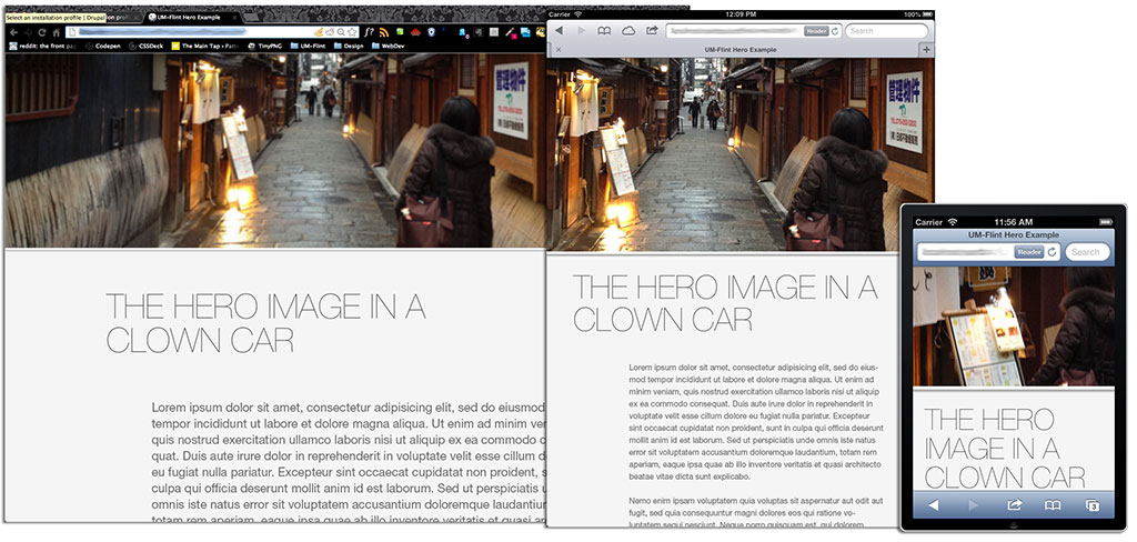
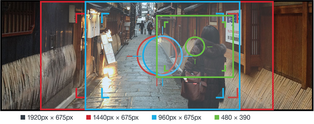
Your image is going to have four breakpoints, meaning it will have four different widths which will refocus your image in four different ways (see below). Our breakpoints are 480 × 390, 960 × 675, 1440 × 675, 1920 × 675. If you’re wondering why the vertical dimension remains 675 for most of these that’s because we have a set height for our hero area of 450 pixels. Having them be 675 pixels tall helps when the images are resized horizontally to fit retina and HD displays. The hero on mobile, however, is only 260 pixels tall.

The Hero Image in a Clown Car
After many months of debating about how to handle fluid images in the website’s responsive redesign, the other web developers in ITS and I settled on using the very recently conceived Clown Car Technique, as written about and implemented by Estelle Weyl on her very informative blog and website, standardista.com.
And, really, there is no better name or description for this technique, because what you wind up with is an SVG file containing some CSS that applies some styles and makes requests for a handful of images via media-queries. On top of that, the SVG is then embedded in an <object> tag, which is “the only native approach that works with HTML” for the time being, until SVG is implemented uniformily across all modern browsers. The only outlier is (of course) Internet Explorer 8. For those folks still using IE8, please, leave the aughts and join us. We’re having a good time. You should be here. There’s cake and ice cream. Also, Google doesn’t support your browser, so seriously, join us.
What Can You Do for Your Hero?
In order to cover the broadest spectrum with as few images as possible, the decision was made to target a medium between both standard-sized (e.g. 320px) and HD/retina (e.g. 640). By doing so we serve a slightly larger image to standard devices and a slightly smaller one than HD/retina displays.
How Did You Choose Sizes for the Hero Image?
A number of things needed to be factored in:
- The most common display resolutions for phones, tablets, laptops, and desktops
- The analytics on how our visitors were accessing the internet and what was trending (mobile traffic jumped from 7% to 13% in one year despite the site’s lack of mobile-friendliness)
- What is the minimum number of images we could serve and still accomodate every display?
- What impact would serving a certain resolution have on loading and rendering time with considerations made for limited data plans and battery drainage.
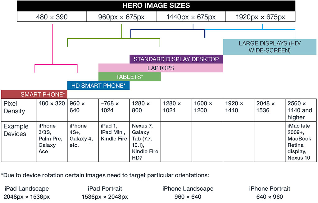
Here’s a breakdown of hero image sizes and what displays they will serve and following that is a more indepth table:

The Process
For starters, you will need the image at its original size when you first download it from your camera onto your computer. As an example, a photo I take with my iPhone will have a pixel density of 3264 × 2448, which gives us more than enough to work with. If you use a stock agency, please make sure you download the largest version of the image (this will cost more, though).
Start to think about how you want to break down this image:
- How’s it going to look when it’s at full-screen on a desktop?
- How’s it going to look on a phone?
- Where is the area of focus?
- How should I crop the image to keep the focus in view at each breakpoint?
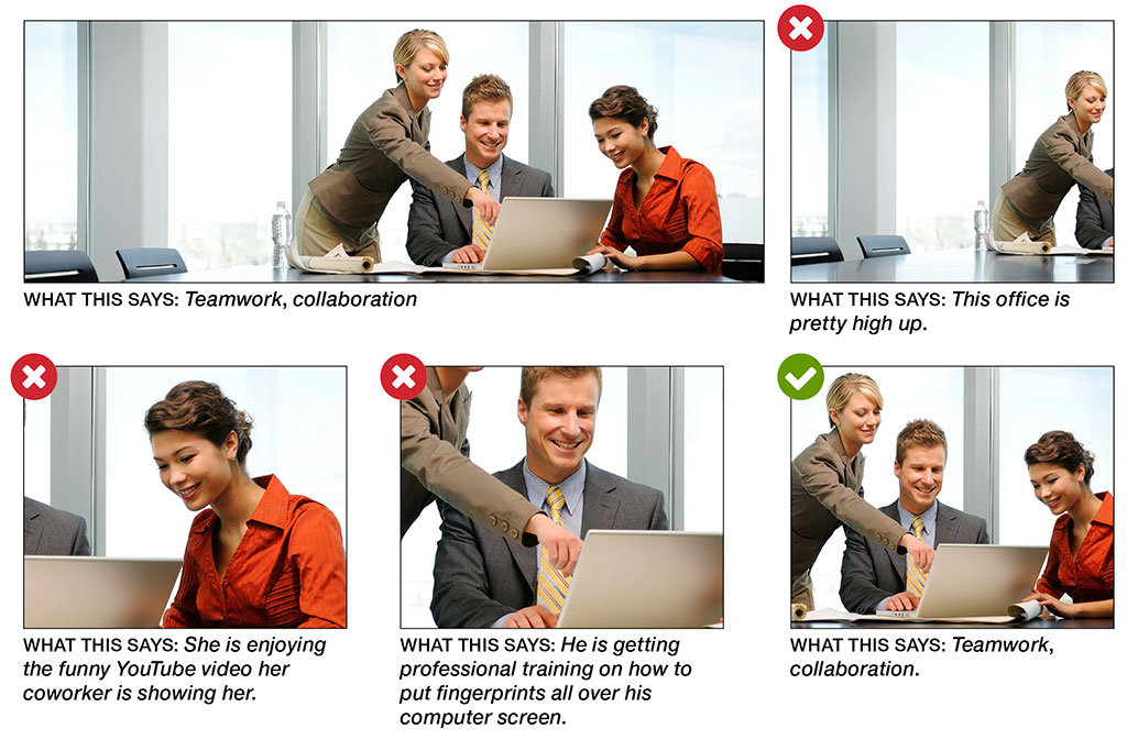
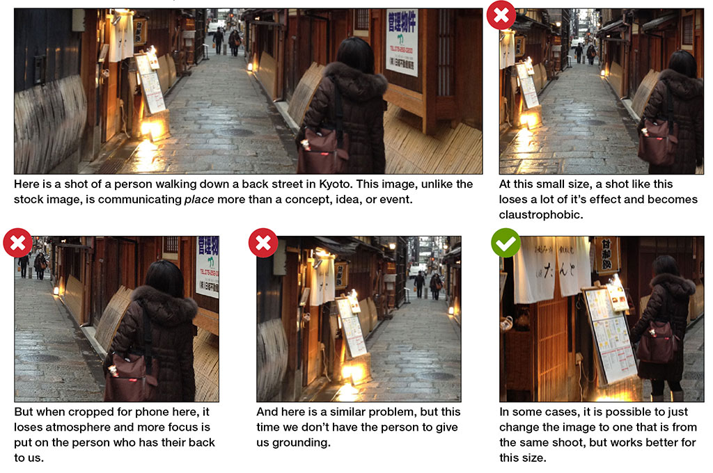
Most of the time you want to just make your crops are based upon where the focus or subject is at, but sometimes, depending on the framing of the image, this can be tricky. Context can change. What our brains pull out of an image can be changed simply by how it is framed. Look at the following examples and you can see just how cropping effects context:
When Can You Get Started?
Right now, unfortunately, there is no way for us to automate the hero process, so, for the first six months, all hero images will need to be run through the Office of University Relations (UREL). However, before Phase 1 of the new website makes its debut, UREL would like to offer every department and school the opportunity to use the services of professional photographers that we will be contracting later this summer. This would be a good chance to help in the process of choosing the hero image that will represent you until Phase II is launched in late-Winter/early-Spring 2014. During that six month period we will be streamlining this process which will hopefully yield more user control than is currently possible. How much control will be possible to hand over—beyond the selection and approval of images—is not knowable at this time. The potential for user error in this area is high due to the many guidelines and the potential for “breaking” your site. We will keep you up to date as this process changes. If you have any further questions, please contact me or UREL and we will try to get back to you as quickly as our currently hectic schedule allows.
SEAN BELLOWS
Web Manager
University Relations @ UM-Flint