


Content and Kipple
The Failures in Our Success
In the crazy rush to overhaul the University website before our contract with our previous CMS-provider expired, a lot of talk was made about content and organization. Unfortunately, that crazy rush left little time to really elaborate on or help out departments with those two things. Instead, people were given a crash course in a brand new CMS and presented with bare bones templates that were, for the most part, no more than a row of two to three columns to cram their previously formatted content into.
While the launch of the site was a success in meeting our initial objectives to bring the vast majority of the university’s content over to the new CMS and to get folks set up in Drupal, the lack of time to really explain and help people organize and present their content just wasn’t there. Because of that, and the departmental lack of time and staff to organize their own content, there are many sections of the site that are “broken” presentationally on mobile displays and, most importantly, inaccessible to people with visual and physical disabilities.
One of the big hurdles that people are facing when trying to get their content organized is grappling with the “device agnostic” internet that has evolved over the last five years. Most people, even if they themselves primarily access the web on their mobile device, cannot grasp thinking of their own content as a fluid jumble of words and bits when they sit down to put it into their own site. That 2005 web is still seared into the unconscious, where a website is a static thing and this bit of information is over here and this bit is over here and we have a gallery and a Java widget and a Flash banner and maybe a GIF of a giant button that animates when we hover over it. The website was always going to be viewed one way on one type of screen and blind people didn’t exist.
“So why is everything broken on my phone?”
Well, there’s a litany of factors: it could be the device, or the browser, or the CMS, or the designer being too naive about how the mass migration of content from a monolithic, bureaucratic institution will mesh with his ideas, or the front-end and back-end developers infighting about how best to do something in a CMS they didn’t have time to understand, resulting in an unscalable mess of code that is the binary equivalent of the world’s most nerve-wracking game of Jenga, orit could be that the content had more thought put into how it was positioned and looked on a desktop rather than what it was saying.
But why do people focus on the presentation of the content rather than the content itself? Well, because for a lot of people, everything is of equal importance so everything has to be given the same weight. If not then there appears to be bias. There’s an oft-repeated, but never cited, quote on the internet that goes: “If everything is important then nothing is important”. Heavy repetition can make this advice seem trite, but it is pointedly appropriate in so many cases and this is one of those.
To Kipple or Not to Kipple
When people approach their content on the web as if it is static, content can lose its purpose. It becomes non-content. It becomeskipple, a term the author Philip K. Dick coined for objects that have lost their stated purpose and now just take up space. And in an era where content needs to pour from one container into another like water without losing it’s meaning, thinking of your site in static terms can make your content into kipple.
[T]he First Law of Kipple, “Kipple drives out nonkipple.” —from Do Androids Dream of Electric Sheep, by Philip K. Dick
But how does our content become kipple and how do we avoid it?
1. Don’t save text as images
If you save your event announcement as an image file and post it to your website it isn’t an announcement. There’s no words for a search engine to crawl, there’s nothing for a screen-reader to read out to the visually impaired person using it, the words in the image become unreadable to people accessing your page from their phone. Essentially, you posted nothing of use to anyone on your site. But you do get to scratch it off of your to-do list.
2. Use real headings, not fake ones
If you make some text bold so that it looks like a heading, it isn’t a heading. It’s text, but it doesn’t convey any structure. In fact, it makes your document lose structure because, most of the time, headings don’t have punctuation, which means you really have an awkward, run-on sentence (at least to screen-readers and web crawlers).
Most of the time, the culprit here is Microsoft Word. When you copy and paste text from a word-processing program into the Drupal WYSIWYG editor, some of that copied content’s style will make it over visually, but it’s structure becomes lost. And if you use the paste-as-plain-text shortcut (CTRL+ALT+V [Windows]/CTRL+⌘+V [Mac]), you’ll find your heading and paragraph have been combined into a single paragraph with a break (soft-return) following where the heading/bold text had originally ended.
For reasons that are too complicated to go into here, headings are stripped from pasted text in Drupal and a plain text paragraph is left instead. So you’ll need to manually add your headings back in anyway.
Using real headings helps users understand the order of your content and it’s good for SEO.
3. Tables are for data NOT layout
Tables can offer flexible, but limited layout control, which is why people used them for laying out entire websites back in the late ’90s and early ’00s. The problem, however, with using tables for layout is that your content loses all semantic value, meaning, like the fake heading, your content isn’t what you say it is. Tables are for tabular data so anythingthat goes into them is now tabular data. And semantic value matters more than ever in an age where information is distributed in unpredictable ways and means. Make your content mean what it says.
4. Avoid duplicate content and pages
Duplicating content can lead to confusion when trying to navigate your site. If your reasoning is that the information is important then it’s better to think more about your contents’ organization and structure (as well as your site’s navigation menu), rather than litter it across many pages. The exceptions to this are your department’s name and contact info, because users might not all be following the same path to wind up on a page of your site.
5. Your main content shouldn’t go in a sidebar
The main content of your page should go into the main column (the big one). Sidebars are for addendum information, sidenotes, if you will. If you don’t have any content in your sidebar then you don’t need to fill it with something. Try to make your pages as lean and as focused as you can. Don’t give a visitor more than they need because you’re only cluttering things up.
6. Not every page needs a social widget
Try to only have one social feed on your site and keep it to your home page. Social feeds drag down a site’s performance quite a bit because they’re tapping into external services. Remember that each piece of content that has to be downloaded is not just using up a visitor’s time but also potentially costing them monetarily. A lot of phone and internet plans have a data cap on them and the heavier your page is the more you are costing your visitors.
7. Your homepage is saying everything and nothing at the same time
Speaking of the social feed, it is primarily a marketing and information tool. This is how people should think of their homepage. This is the place where you market yourself. It’s where a department can say who they are, what they offer, and then (most importantly!) assist visitors in getting to the information that they really want to get to.
A homepage is really not thee page. Most people do not want the content that is on a homepage, because what they really want is only the information that matters to them and a homepage is more like a cross-breed between a movie trailer/teaser and a directory. But remember, people shouldn’t have to visit your homepage to get to the information they want. When people want to get to Point C, don’t make them go to Points A and B first.
8. The Left-Hand Sidebar
Try to keep the left sidebar lean. If you want to put content into the it then try to keep that content to a minimum. Only a couple of widgets, beside the department menu, were designed with the intention of fitting into it due to its narrowness and placement: the info-sidebar and blurb widgets.
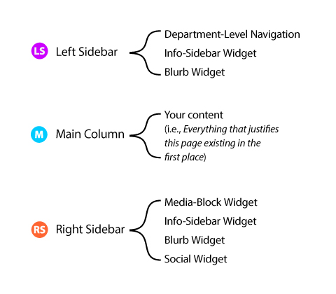
Each column is meant to handle a certain type of content or widget
News and social feeds do not have optimal space in this column to display in any appealing or functional way. The same goes for videos, images, tables, and external services that use an iframe (such as a Google calendar or a Flash-/Java-based chat widget). And when using the info-sidebar in this column, try to keep the information to a minimum as well, focusing only on the content that should be at the forefront of your website: i.e., your department’s contact information, hours, and address.
One of the main reasons for this is that, when the site breaks down to mobile, the content in the left sidebar will be first in the document order flow (following the hero/header area). If you put too much infor or too many widgets in the left sidebar then that’s more stuff that people have to scroll through to get to the main content of your page.
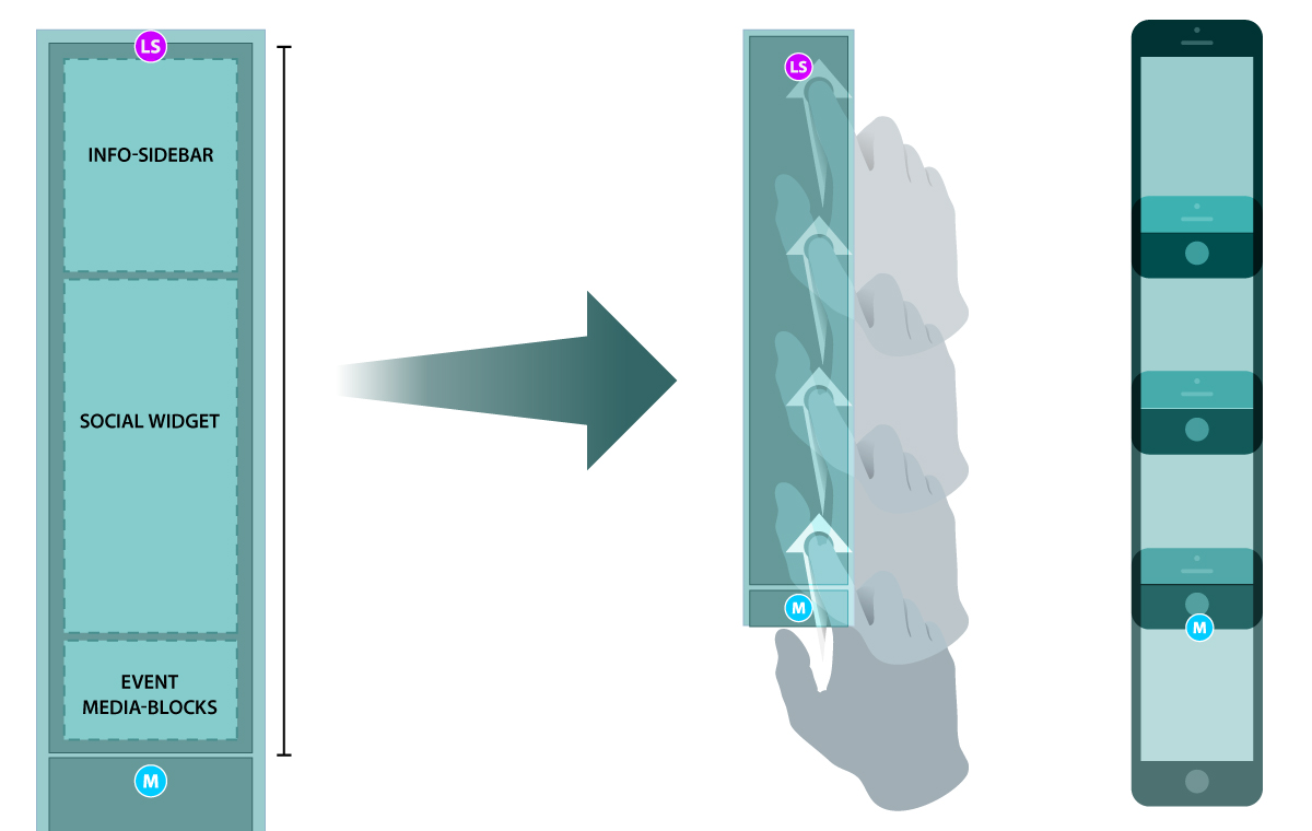
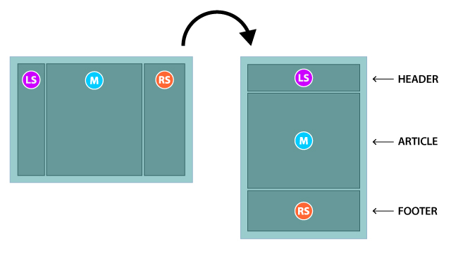
Rather than thinking of the page’s layout horizontally, left to right, think about it vertically with the left sidebar on top, then the main column, and then the right sidebar at the end. So if you were to think of it as one complete document, the left sidebar is the table of contents and attribution area (your name, your address, etc.), the main column is your thesis or article, and the right sidebar is a footer where you would put citations and addendums or notes.
9. Tabs and Accordions
Lots of folks seem to be very confused about when and how to use tabs and accordions. Here’s a brief breakdown:
Tabs
The purpose of tabs is to permit users to view a group of related data one at a time, which in turn allows you to modularize this group of information in a compacted manner, saving valuable screen real estate and allowing easier user-access to the content they specifically desire. Think of tabs as sub-navigation that falls under one menu link. For example:
Services we offer
⌊ [ Printing ] [ Brochure Design ] [ Lamination ]
Services we offer is the broad field name while Printing, Brochure Design, and Lamination are the categories that fall under that field name.
Accordions
Like tabs, this is all about presenting information in a compact, screen-saving manner. However, with accordions, content is identical in the type of information it is presenting.
In tabs, the content that falls under Printing could be very different and displayed in a manner that is not repeated in Brochure Design. Printing could have a list of printing costs inside of a small data table, while Brochure Design is an unordered list of design options or methods.
On the other hand, in accordions, all content that falls under a link heading should be presented in exactly the same way. The best example is a Frequently Asked Questions (FAQ) page. Each accordion link heading could be a question and the content inside would be the answer.
Here’s some other things to keep in mind when deciding between tabs or accordions: It is a bad idea to place too much content into an accordion because then the user has to scroll down to click the next accordion link if they want to see that content, just to have it expand up and then scroll back up in order to view it.
The short rule: Tabs = similar types of content Accordions = the same types of content