


One Maize. One Blue.
Color is an important aspect to a brand’s identity. Most people in this country, and even around the globe, recognize that Michigan is synonymous with maize and blue, just as much as Target is identified with the color red. Color evokes emotions and creates perceptions. Blue conjures up feelings of authority, success, power, and serenity, while varying shades of yellow and orange create feelings of happiness, positivity, and creativity. These are all great reasons to love our maize and blue even more.
The University of Michigan and its three campuses in Ann Arbor, Flint, and Dearborn have refreshed their brand identity, which include new, richer and bolder colors. There is now one, official set of colors to represent the entire University of Michigan system. One blue. One maize. The new palette was chosen to work across all platforms so they will be consistent on the web, in a four-color process, or as a spot color on coated and uncoated papers alike. The official blue is now several shades darker and creates a feeling of prestige, while the maize creates a high contrast to the deep blue and makes for an unforgettable mark.
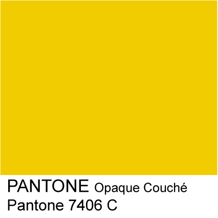
Maize
PMS: 7406
CMYK: C=0 M=18 Y=100 K=0
Hex: #ffcb05
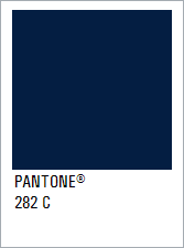
Blue
PMS: 282
CMYK: C=100 M=65 Y=0 K=55
Hex: #00274c
These identity changes coincide with an updated University of Michigan logo that is now also consistent across the three University of Michigan campuses, and can officially be used beginning today on the Flint campus. The new and official University of Michigan-Flint logo can be found and downloaded by faculty and staff from MediaBin. Let us know what you think of these new and improved colors and what feelings the new logo create for you.