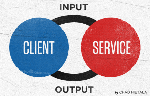
Input Output

Any business, public or private, has an input/output paradigm. You give a clerk $2, you get a soda. You enter a number in a phone, you get some sort of response on the other end. You go to Google and enter a search term, you get search results. Even such vital things as hospitals work this way. It’s this constant balancing act between give and take.
Communication online is done through input and output (IO). Give me something and I’ll give you something. Everything is IO when related to the internet, from how a computer processes an HTTP request to how people communicate online. This digital process of input and output has to remain as easy as if it were a physical one.
COMMUNICATING ONLINE
Communicating online is done largely through forms. At first one would think this is not true. Text areas, input boxes, buttons, check lists, and drop-downs are all interactive form elements and they are the root user interface communication tools for the internet. Since communications are digital and not physical, there is a hurdle that has to be cleared to enable users to initiate input.
So if forms are the leading means of communicating back and forth from client and service, one can argue that web forms are the most important thing on a website. With a web form you capture that casual surfer. Web forms can help businesses qualify perspective clients, current clients, and past clients. It is a direct communication with the business entity. It can be compared to picking up a phone and calling the person or going to the physical business.
IT’S DEFINITELY THE SMALL THINGS THAT COUNT
Position of labels and default length of input fields seem like frivolous details when it comes to web forms. THEY ARE NOT. Research has shown time and again that these small details lead to faster, less painful, completion of a form. Eye tracking studies show that the number of fixations the eye has on a form, the longer and more “painful” it is for that form to be filled out. By following some simple best practices or using form services, more forms will be filled out and filling out those forms will be easier.
These things may seem trivial, but they really are what make the difference between a pleasurable experience and a confusing chore-like one. Sure, people don’t look forward to filling out forms, but they are necessary and should strive to be as pain-free as possible. By paying attention to the small details and making things as easy as possible, you can begin to condition a user to be more prone to do the thing you want them to do.
WEB FORMS MATTER!
Having pain points in a form is something that needs to be avoided at all costs. By breaking down some of the communication barriers that exist online, a business can greatly increase their revenue and interactivity. It has a direct impact on a business.


