Commonly Confused Graphic Design and Web Design Terms and Concepts

As we all move forward with both the new brand/identity roll out, as well as the web transition to Drupal, it will be increasingly important to be on the same page as far as the terminology we use to described various items, actions, and ideas.

The following are some of the more immediate terms (and uses) we should get a handle on:

The Official UM-Flint Logo:

Official UM-Flint Logo

Proper Use of this Logo:

• This version is the official UM-Flint Logo.
• For better connection and consistency among Ann Arbor, Dearborn, and Flint, all 3 have adopted this maize Block M inside the dark blue box as our primary identity marks.
• You may hear this version referred to as “the stamp,” and should be used just as you see it here for both print & digital (web) uses.
• The other versions of this logo are intended only for 1-color print jobs, such as promo items. Yet because 4-color printing is itself a communicator of “quality & prestige,” 1-color designs & logos should rarely be used.

Official UM-Flint Wordmark:

Official UM-Flint Wordmark

Proper Use of this Graphic:

• This is the official University of Michigan-Flint wordmark
• When UM-Flint’s Office of University Relations launches the new print & email template system, departments will not need to recreate stationery, etc. with this nor any of the 1-color versions.
• The other versions of the wordmark are intended only for 1-color print jobs, such as promo items. Yet because 4-color printing is itself a communicator of “quality & prestige,” 1-color graphics should rarely be used.


Horizontal Department Signature Mark:

Horizontal Department Signature Mark

Proper Use of this Graphic:

• For better connection and consistency among Ann Arbor, Dearborn, and Flint, all 3 campuses have adopted this identity structure at all levels.
• Units are encouraged to utilize the full-color, horizontal version of their signature mark, as it is easier to read than the vertical option, and taps into the power and prestige of our official colors (maize & blue) contrasted together—not on white, etc.
 • The other versions of this graphic are intended only for 1-color print jobs, such as promo items. Yet because 4-color printing is itself a communicator of “quality & prestige,” 1-color designs & graphics should rarely be used.


Vertical Department Signature Mark:

Vertical Department Signature Mark

Proper Use of this Graphic:

• Units are encouraged to utilize the full-color, horizontal version of their signature mark, as it is easier to read than this vertical option, although this version may fit certain spaces/projects better.
• Always strive to use the full-color versions, as they tap into the power and prestige of our official colors (maize & blue) contrasted together—not on white, etc.
• The other versions of this graphic are intended only for 1-color print jobs, such as promo items. Yet because 4-color printing is itself a communicator of “quality & prestige,” 1-color designs & graphics should rarely be used.


Horizontal School/College Signature Mark:

Horizontal School/College Signature Mark

Proper Use of this Graphic:

• For better connection and consistency among Ann Arbor, Dearborn, and Flint, all 3 campuses have adopted this identity structure at all levels.
• Units are encouraged to utilize the full-color, horizontal version of their signature mark, as it is easier to read than the vertical option, and taps into the power and prestige of our official colors (maize & blue) contrasted together—not on white, etc.
• The other versions of this graphic are intended only for 1-color print jobs, such as promo items. Yet because 4-color printing is itself a communicator of “quality & prestige,” 1-color designs & graphics should rarely be used.


Vertical School/College Signature Mark:

Vertical School/College Signature Mark

Proper Use of this Graphic:

• Units are encouraged to utilize the full-color, horizontal version of their signature mark, as it is easier to read than this vertical option, although this version may fit certain spaces/projects better.
• Always strive to use the full-color versions, as they tap into the power and prestige of our official colors (maize & blue) contrasted together—not on white, etc.
• The other versions of this graphic are intended only for 1-color print jobs, such as promo items. Yet because 4-color printing is itself a communicator of “quality & prestige,” 1-color designs & graphics should rarely be used.


Head’s Up

Perhaps the biggest confusion-causing culprit is the word header. This mini-glossary seeks to avoid all confusion that can arise from using the terms header, heading, and headline interchangeably. In the past, header has been used to describe any graphic, photo, or text (or combination thereof) appearing atop any page—print or digital. A similar ubiquitous meaning arose for the term logo. To be clear, UM-Flint has only one logo.

The following should help us all be more precise about what we mean when we talk about these things:

Headline:

When we talk about headlines, we really do mean the more traditional, more journalistic meaning. Headlines are text only. Headlines announce the contents of an article, or a blog post, or a Pillars news feature. There may be times when it may seem appropriate to refer to a headline as a title. Yet, title, as we will see with heading, has a dedicated meaning in the web context.

Title:

When we talk about a title (as in page title, not occupational title), more than likely we are talking about text that describes the contents of an entire web page. This usually mirrors the text that appears in a website’s navigation. To help illustrate the difference between a title and a headline, one might imagine a web page titled “Club Sports Highlights,” and that page including numerous headlines of individual club sports stories.

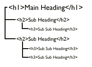
Heading (and Sub Headings):

Headings do not describe pages or articles. Headings describe sections of content within pages and articles. An entire blog post could be (will be) written about best practices related to proper heading/sub-heading use for improved readability, scannability, and overall structuring of web content. Don’t be afraid to use them. Headings (h1) and subheadings (h2) are your friends. More than that, they are readers’ friends. Nobody likes slogging through big blobs of never-ending text. Give eyes, and your websites’ users, a break.

Headings and Sub Headings

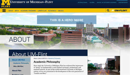
Hero Image (or Hero Graphic):

Along with signature mark, the hero image is probably confused for a header more than any other graphic. In each case, what people are usually referring to is a large, visual attention-grabber. Whereas both signature marks and our old conception of headers almost always included text (think of the “department header”), the hero image is usually just a powerful image, a photo that tells a story all by itself. The new templates being created for the Drupal transition utilize (text-free) hero images.

Hero Image Example

Header:

Header means too many different things to too many different people. For the sake of clarity and to stave off confusion, let’s erase this term from our brand/web lexicon! ; )