


Here It Is, Your Moment of Venn…
 There is no better way to visually represent the “greater-than-the sum-of-its-parts” concept that is UM-Flint’s MORE brand than with a Venn diagram.
This centuries old way of depicting the relationships between seemingly disparate entities, is a tried-and-true best practice in the world of design (and of course, mathematics). When you think about it, each individual’s UM-Flint story is a multi-layered, multi-faceted, and overlapping combination of people, passions, and pursuits that come together to form a totally unique experience. In this sense, the Venn diagram becomes a powerful, but infinitely flexible, storytelling framework.
For example:
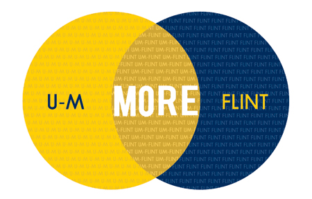
The University of Michigan + The City of Flint = MORE
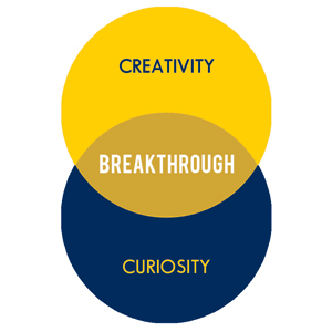
The Office of the Research might be expressed this way:
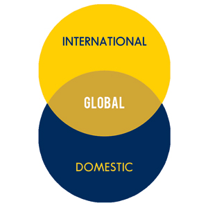
And the globalization of the UM-Flint campus might look like this:
You get the idea. But the question is, when to Venn?
Honestly, despite all its functionally, flexibility, and visual flare, it is a design treatment that can get real old real fast. We don’t want that to happen. So in an effort to stave off overkill, it may be helpful to brainstorm with your department or unit the single, best “Venn story” that describes how your team adds value to the education of UM-Flint students.
But beyond this danger of graphical overexposure, the idea of interesting intersections between two or more (any)things remains a powerful and readily deployed storytelling device. One that describes many of the most exciting initiatives that take place on this campus. (Poetry + Graphic Design + Flint Historical Archives = The Flint Poetry Map project. Ta-dah!) So please, feel free to play around with the various design and narrative applications, and use MORE Venn today!